
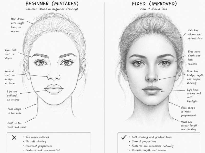
You spent an hour on a portrait, and everything looked great — until you got to the nose. Or the lips. Suddenly it all falls apart. The face that was looking so good now feels off, stiff, or weirdly cartoonish. Sound familiar?
Trust me, I’ve been there more times than I can count. The nose and lips are two of the most frustrating features to draw — not because they’re impossible, but because most of us are making the same small mistakes over and over without even realizing it.
The good news? Every single mistake has a clear, simple fix. In this article, I’m going to walk you through the most common mistakes when drawing noses and lips — and more importantly, exactly what to do instead. Let’s go through each one, step by step.
Common Mistakes When Drawing Noses
The nose is one of the trickiest facial features to get right. Most beginners make the same handful of mistakes — here’s what they are and how to stop making them.
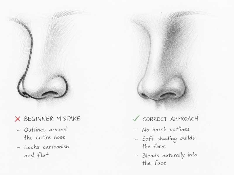
Mistake 1 — Drawing the Nose as an Outline Shape
This is probably the most common nose drawing mistake I see from beginners, and I made it myself for years. You draw the whole nose as a shape — you trace around the sides, around the nostrils, around the bridge — and end up with something that looks like a cartoon nose floating on the face.
Here’s the problem: real noses don’t have visible outlines on the sides. If you look at a face in natural light, the nose blends into the surrounding skin. There’s no dark line running down the side of someone’s nose in real life — that’s just not how light and shadow work.
The fix: Stop drawing the nose as an outline. Instead, lightly sketch the nose shape as a construction guide, then erase the outlines before you finish.
Build the nose using shading and value changes — soft shadows on the sides, darker tones near the nostrils, and a gentle highlight on the tip. The outline disappears and the nose suddenly looks like it belongs on the face.
Mistake 2 — Making the Nostrils Too Large or Too Dark
I used to do this one constantly. I’d get so focused on the nostrils that I’d make them way too big and fill them in completely black — and suddenly the nose looked like it belonged on a cartoon pig, not a human face.
From the front, nostrils are actually pretty subtle. They sit partially underneath the nose tip, they’re not the biggest feature of the nose, and they’re definitely not solid black holes.
The fix: Keep your nostrils small and soft. From a front view, shade them with a medium-dark tone rather than filling them in completely. Always look at the size of the nostril relative to the nose tip — the tip should feel like the dominant shape, not the nostrils. A light touch goes a long way here.
Mistake 3 — Getting the Nose Angle Wrong
This one breaks a lot of portraits. When a face is tilted up or down, many artists still draw the nose as if the person is looking straight forward. The result is a face that looks broken — like the nose is going one direction and the rest of the face is going another.
The nose has to follow wherever the face is pointing. If the head is tilted up, you should see more of the underside of the nose. If it’s tilted down, the bridge becomes more visible and the nostrils almost disappear.
The fix: Before you draw a single facial feature, establish your head tilt. Draw the center line of the face and the horizontal eye lines first. These act as your guides. Once those are in place, align your nose to follow them naturally — and the angle problem solves itself.
Mistake 4 — Forgetting That the Nose Has 3D Depth
A flat nose is a nose that just shows the front view with no sense of volume — like someone pressed it against a window. It has no projection, no depth, and it looks pasted onto the face instead of growing out of it.
Real noses stick out. There’s a bridge that projects forward, a tip that pushes out even further, and nostrils that curve underneath. The nose is a 3D object sitting in the middle of the face.
The fix: Start thinking about the nose in three planes. The top plane (the bridge) usually catches the most light. The front plane (the tip) is a mid-tone.
The under-plane (where the nostrils sit) is almost always in shadow. Shade each plane differently based on where your light source is coming from, and suddenly the nose has real volume.
Common Mistakes When Drawing Lips
Lips are expressive, complex, and surprisingly hard to draw. Here are the most common traps artists fall into — and the exact fixes to make your lips look full and real.
Mistake 1 — Treating Lips as Just Curved Lines
Almost every beginner does this one — I certainly did. You draw a curved M-shape on top for the upper lip and a curved arc on the bottom for the lower lip, and then you wonder why the lips look completely flat and fake.
Lips are not lines. They’re forms. The upper lip has three distinct rounded shapes — two on the sides and a smaller peak in the middle (the cupid’s bow area). The lower lip is made of two soft, rounded pillows sitting side by side.
These are three-dimensional volumes, not just the edges of a thin shape.
The fix: Think of lips as 3D objects, not line drawings. Start by sketching five simplified volumes — three for the top lip, two for the bottom. Shade each volume separately, with soft edges between them.
Once you stop thinking “lip-shaped line” and start thinking “rounded forms,” everything clicks.
Mistake 2 — Drawing the Outline Darker Than the Shading
This is a really common realistic lips drawing mistake, and it immediately makes lips look unnatural. Artists will draw a strong, dark line around the entire lip — especially along the top edge of the upper lip — thinking it will make the lips look more defined.
But here’s what actually happens in real life: the top edge of the upper lip often catches light from above, making it lighter, not darker. A heavy outline on top flattens everything and makes the lips look like they were stamped onto the face.
The fix: Never outline the top edge of the upper lip with a dark line. Instead, let the shading in the skin above the lip naturally define where the lip begins.
The only line that can be slightly heavier is the center crease between the upper and lower lip — and even that should vary in thickness, getting slightly thinner in the middle and a touch stronger near the corners.
Mistake 3 — Making Both Lips the Same Tone
I see this all the time — the upper and lower lip both shaded with the same gray value, making the whole mouth look completely flat. They’re two completely different surfaces catching light differently, so they should never look the same.
Think about it this way: the upper lip faces downward and slightly forward. It tilts away from a light source coming from above. The lower lip faces upward and forward — it tilts toward the light. One is catching light, one isn’t.
The fix: Always shade the upper lip darker than the lower lip when your light is coming from above (which is almost always the case in portraits).
The lower lip should be noticeably lighter, with a highlight sitting right in the center. That little bright spot on the lower lip is what gives it that full, soft, realistic appearance — don’t skip it.
Mistake 4 — Ignoring the Corners of the Mouth
The corners of the mouth are where portraits either come together or completely fall apart. Beginners usually do one of two things: they draw sharp, pointed corners like a cartoon character, or they just trail off and leave the corners undefined.
In real life, the corners of the mouth fold softly inward and create small, subtle shadows. They’re actually the darkest points of the entire lip area. Getting these right is what makes a mouth look like it belongs in a real face.
The fix: Draw the corners with a small, soft shadow that gently fades into the surrounding skin. The center crease line between the lips should be thickest and darkest at the corners, then gradually thin out toward the middle. Never end the corner with a sharp point — always let it soften and blend. That small change makes a huge difference in how natural the mouth looks.
Quick-Fix Summary — Nose & Lips Cheat Sheet
Here’s a fast reference you can keep at your drawing desk.
| The Mistake | The Fix |
| Drawing the nose as an outline | Build the nose with shading, not outlines |
| Nostrils too large or too dark | Keep nostrils small and softly shaded |
| Nose angle doesn’t match the face tilt | Establish head tilt lines before drawing any features |
| Nose looks flat with no depth | Think in three planes: bridge, tip, and under-plane |
| Lips drawn as curved lines | Draw lips as five 3D volumes, not outlines |
| Top lip outlined too darkly | Let shading define the lip edge, not a hard line |
| Both lips the same tone | Upper lip darker, lower lip lighter with a highlight |
| Corners drawn sharp or ignored | Soft shadows at corners, line thickest at edges |
How to Practice Drawing Noses and Lips Correctly
Knowing the fixes is one thing — getting them into your muscle memory is another. Here’s how I’d recommend practicing if you want to see real improvement fast.
Fill a full sketchbook page with just nose studies. Different angles, different lighting setups, different face shapes. It sounds boring, but it’s the fastest way to stop making the same mistakes.
Do the same with lips — a whole page of nothing but mouth studies. By the time you fill the page, you’ll be drawing them completely differently than when you started.
Use a mirror. Your own nose and lips in natural light are one of the best references you have — and they’re always available. Spend ten minutes just observing before you draw.
Where does the light fall? Where are the shadows? What does the top edge of your upper lip actually look like?
Always practice from reference photos before drawing from imagination. Imagination is great, but it fills in the gaps with what you think something looks like — which is usually wrong. Real photos show you what you’ve been missing.
Draw the same nose or set of lips ten times in a row, focusing on fixing one specific mistake each time. Not ten different noses — the same one, ten times. That repetition locks in the correction faster than anything else.
And slow down. Seriously. Most drawing mistakes happen because we rush through the nose and lips to get to the “easier” parts of the face. These features deserve more time and attention than any other part of the portrait.
Mistakes are not setbacks — they’re the fastest way to learn. The more noses and lips you draw wrong, the faster you’ll figure out how to draw them right. Every bad drawing is just data. Use it.
Frequently Asked Questions (FAQ’s)
Why does my nose drawing always look flat?
Because you’re building the nose with outlines instead of shading. The nose gets its three-dimensional form from light and shadow — not from lines drawn around it.
Try breaking the nose into three planes: the bridge at the top, the tip in the middle, and the nostril area underneath. Shade each plane slightly differently based on your light source, and the flatness disappears.
Should I outline lips when drawing?
Not with a dark, heavy line — especially not along the top edge of the upper lip. The lip edge should be suggested through tonal changes in the surrounding skin, not drawn as a solid border.
The one exception is the center crease between the upper and lower lip, which can be slightly darker — but even that line should vary in thickness and never be uniform from corner to corner.
Why do my nostrils look like a pig’s nose?
You’re most likely making them too large and filling them in too dark. From a front view, nostrils are actually quite subtle — they sit mostly underneath the nose tip and are only partially visible. Shade them softly with a medium-dark tone rather than solid black, and make sure they’re proportionally smaller than the nose tip.
Observe reference photos closely to see just how understated they really are.
Why does the bottom lip look fake in my drawing?
Almost certainly because it’s shaded too dark. The bottom lip faces upward and catches significantly more light than the upper lip — which means it should actually be one of the lighter areas of the mouth.
The most important detail on the lower lip is the highlight right in the center. Shade it lightly and then use a kneaded eraser to gently pull that highlight back out. That single step makes the lower lip look full and real.
How do I make lips look 3D instead of flat?
Stop drawing lips as two curved lines and start thinking of them as five separate rounded forms — three volumes across the upper lip and two across the lower lip.
Shade each form individually with soft transitions between them. Keep the upper lip darker overall since it faces away from the light, and leave a highlight on the lower lip. That combination of separate volumes plus correct lighting is what creates the illusion of depth.
What pencil is best for drawing lips and noses realistically?
Start with a 2H pencil for your light construction lines and basic structure — it’s light enough that you can erase it easily. Move to an HB for mid-tones and general shading. Switch to a 2B or 4B for your darkest shadows, like the center lip crease and the under-plane of the nose.
A kneaded eraser is essential for lifting out highlights, especially on the lower lip and nose tip. Blending stumps or even a rolled piece of tissue paper help smooth transitions between tones without leaving pencil texture behind.
For more on choosing the right pencils for portrait drawing, we’ve got a full breakdown on ChooseMarker.
Final Thoughts
Whether it’s the nose or the lips — or both — the fix is almost always the same: slow down, observe carefully, and build form instead of outlining. Stop drawing what you think the feature looks like and start drawing what’s actually in front of you.
These eight mistakes are incredibly common, which means fixing them puts you ahead of most self-taught artists right away. Pick one mistake from this list and focus on it for your next three drawing sessions. Just one. You’ll be amazed how much your portraits improve from a single targeted fix.
Which mistake are you most guilty of? Drop it in the comments — I’d love to know, and it helps me figure out what to write about next.
If you want to take your portraits even further, check out our guide on how to draw realistic eyes for beginners — because once the nose and lips are sorted, the eyes are usually the next thing that needs attention.